I. AKOYA
( 01 )
( 02 )

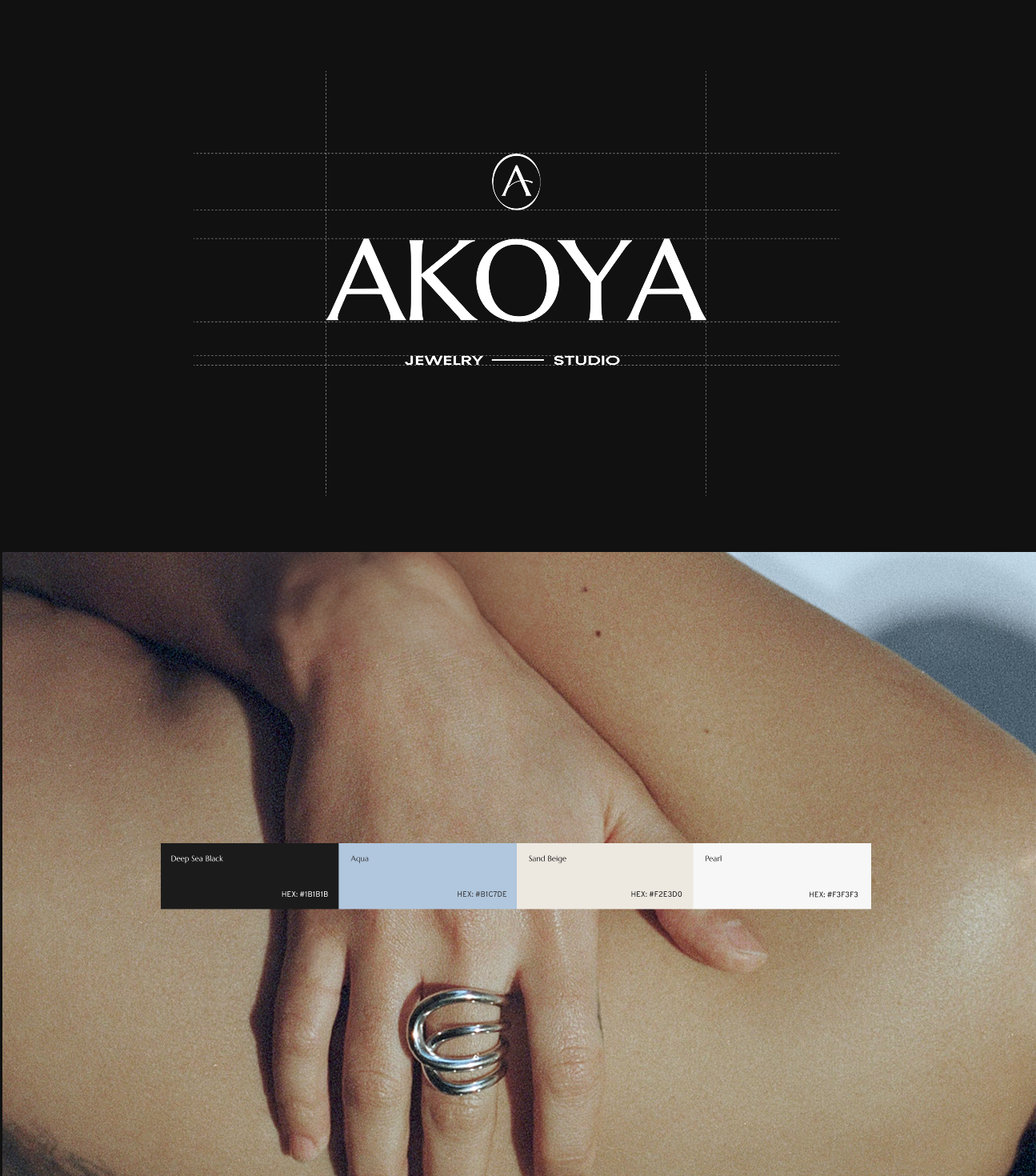
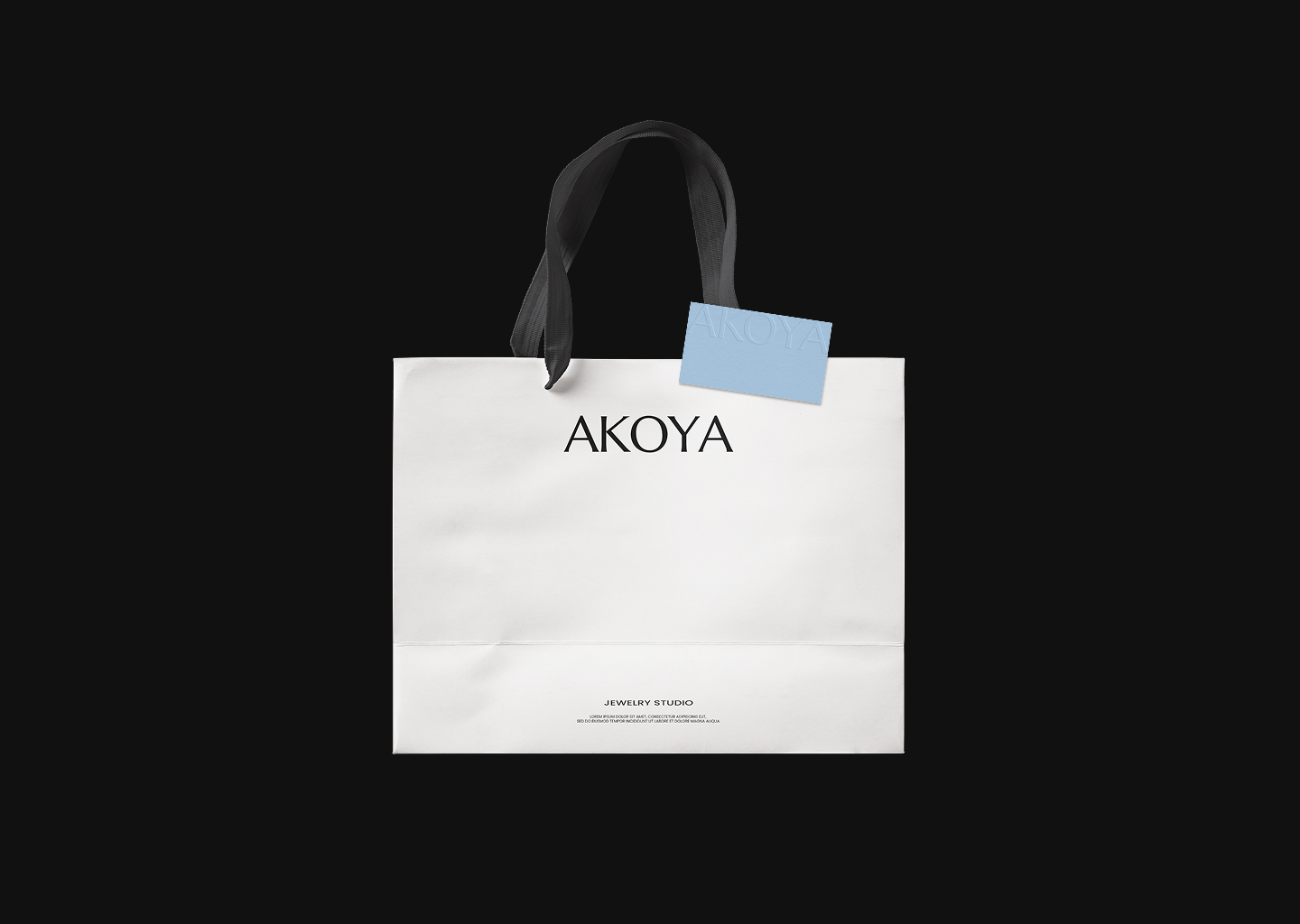
Logo. Color Direction
Logo Icon
( Overview )
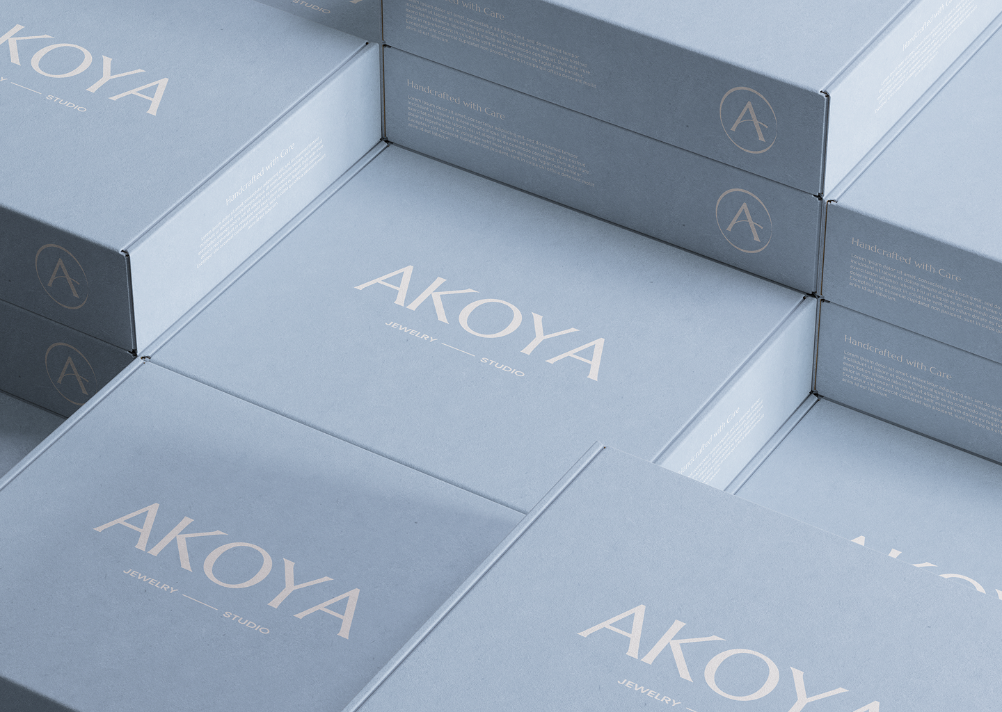
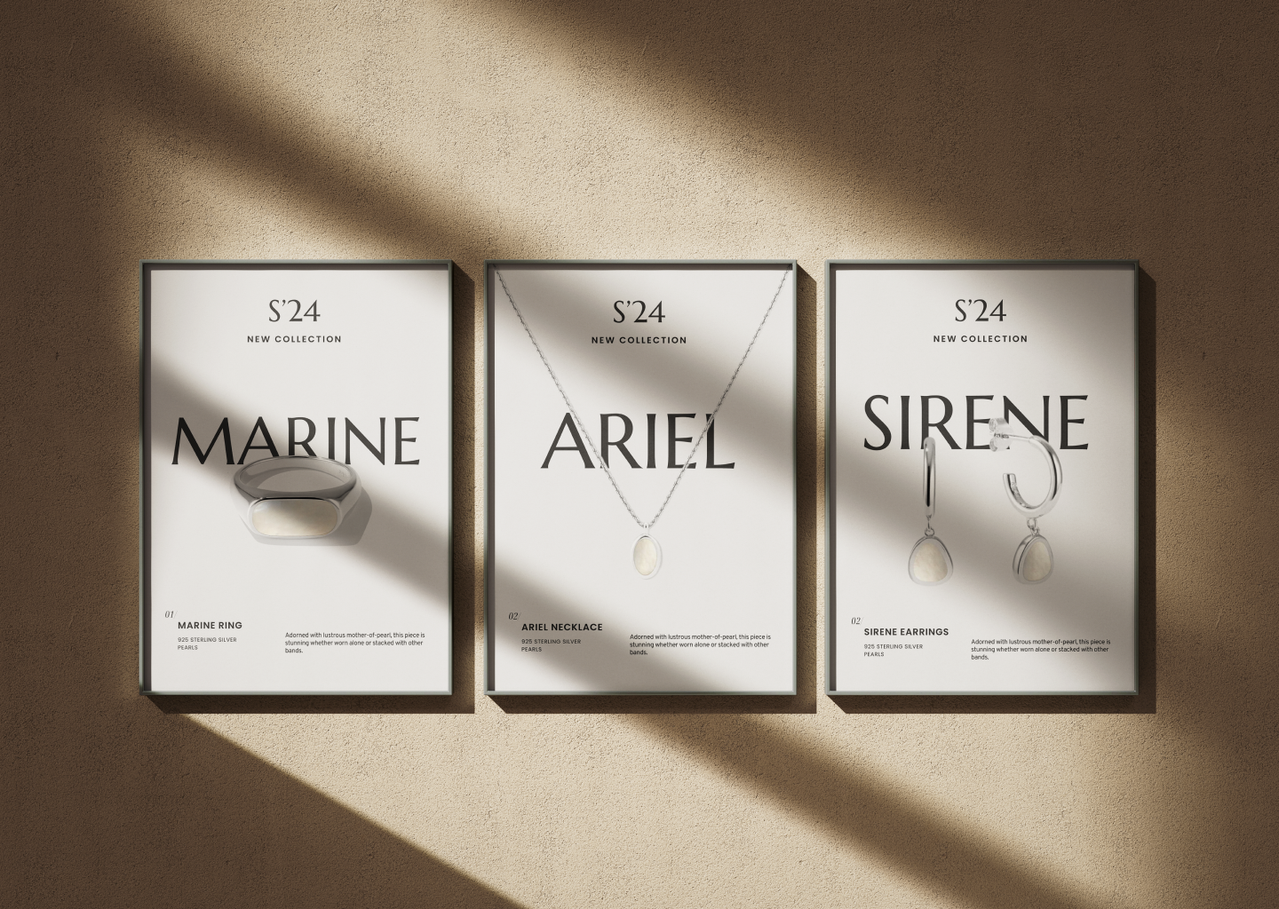
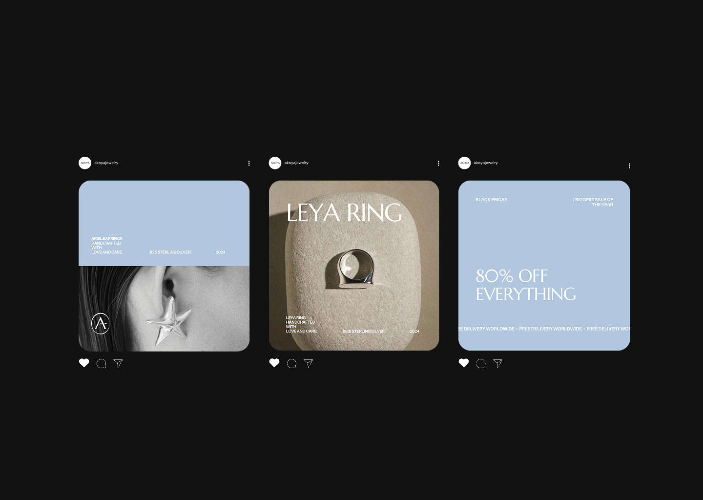
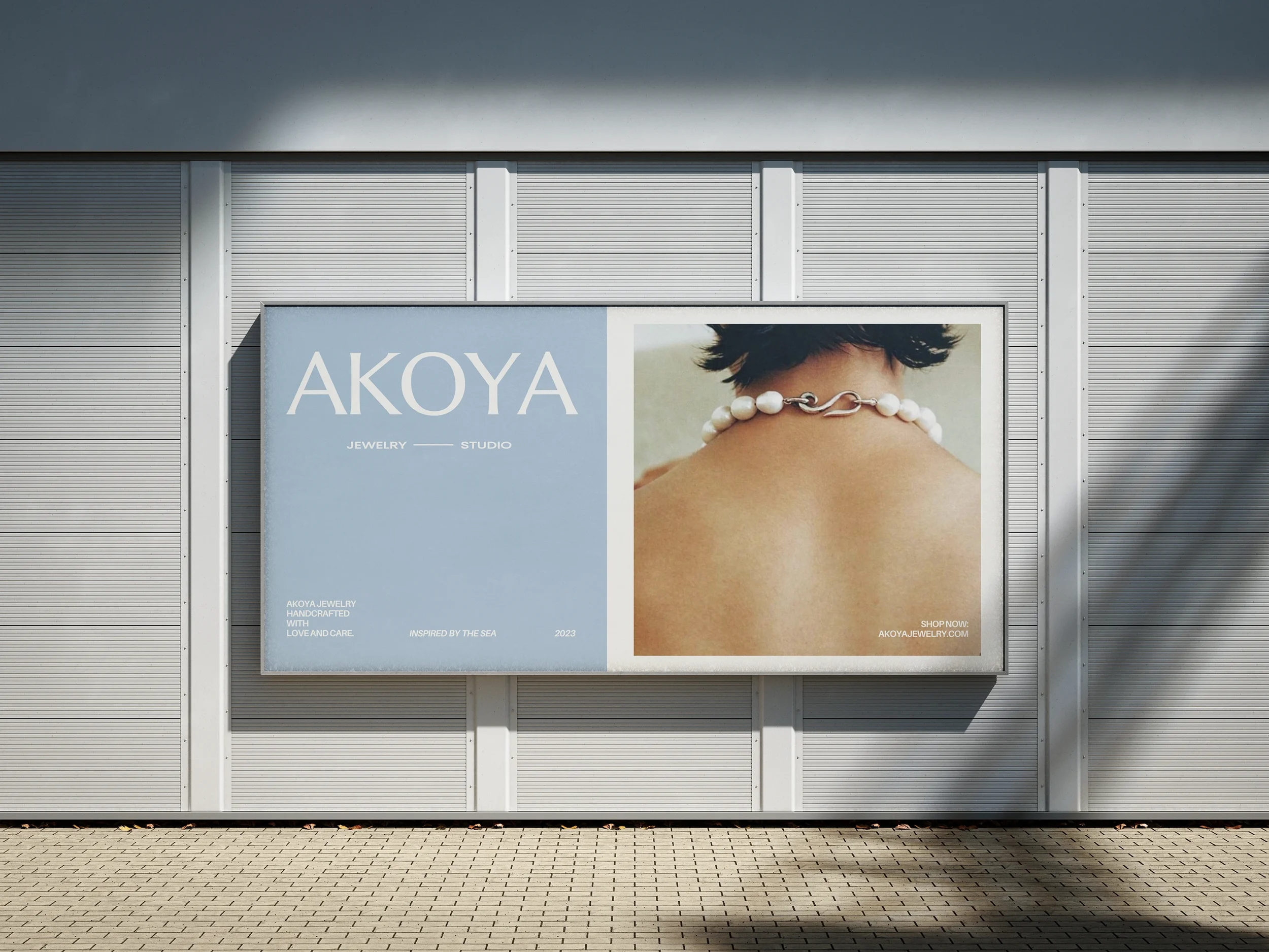
Inspired by the calm strength of the ocean, AKOYA Jewelry brings together craftsmanship, quality, and emotion in every piece. The brand identity and digital experience were designed to mirror this sensibility — minimal, refined, and timeless — capturing the depth, purity, and elegance that define the AKOYA story.
( Visual Identity )
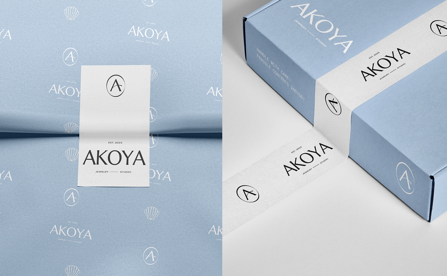
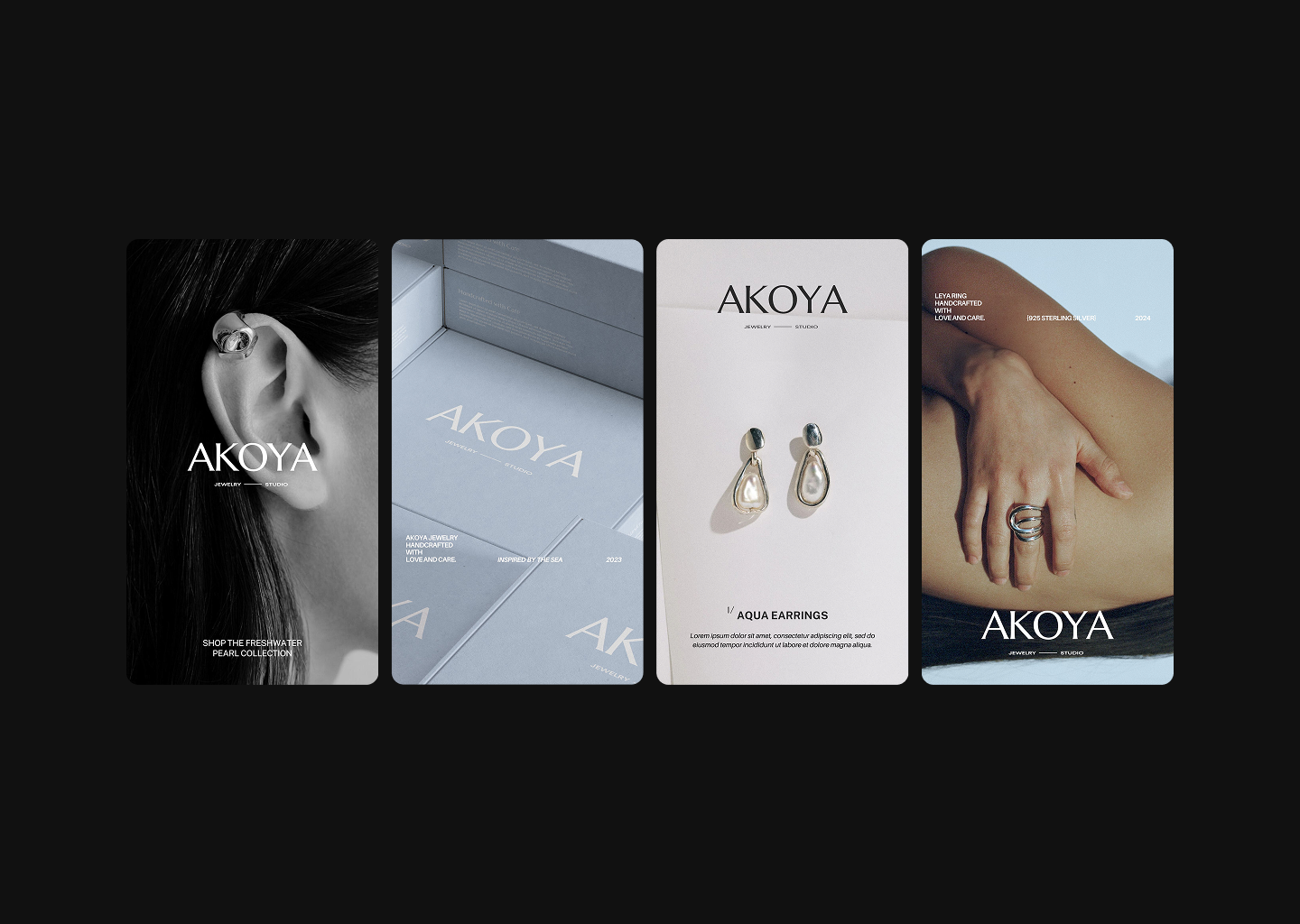
A minimal, editorial approach combining soft neutrals, elegant typography, and generous spacing. The system emphasizes light, texture, and subtle detail to reflect the natural beauty of pearls.
( Solutions )
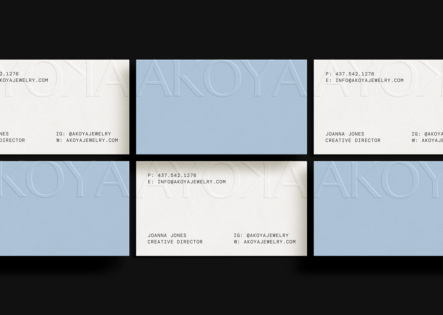
Brand Identity
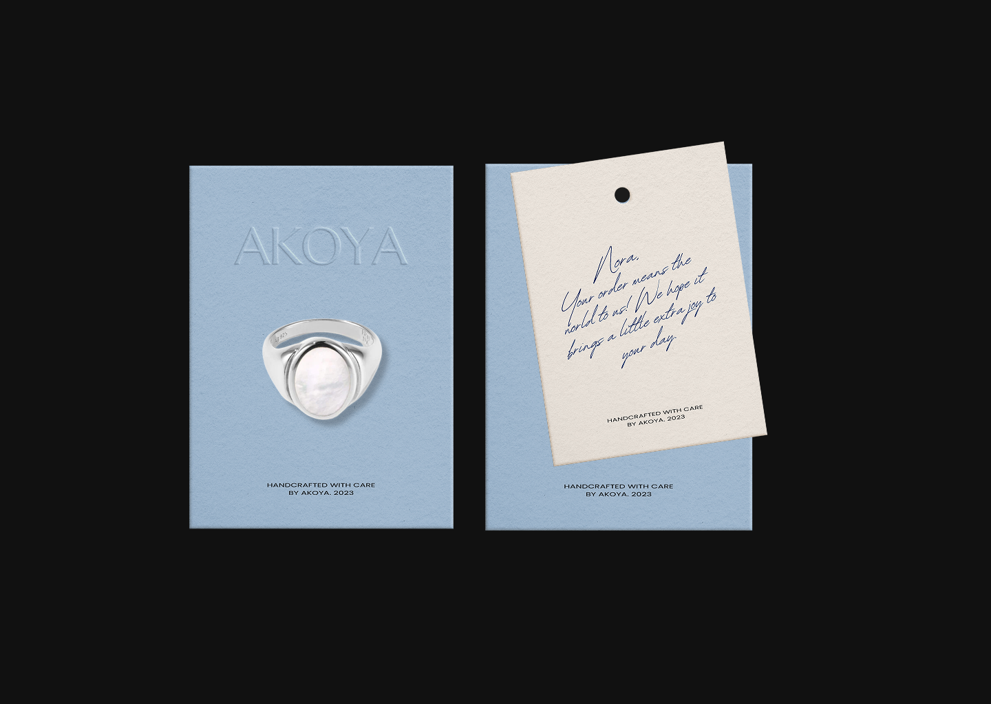
Packaging
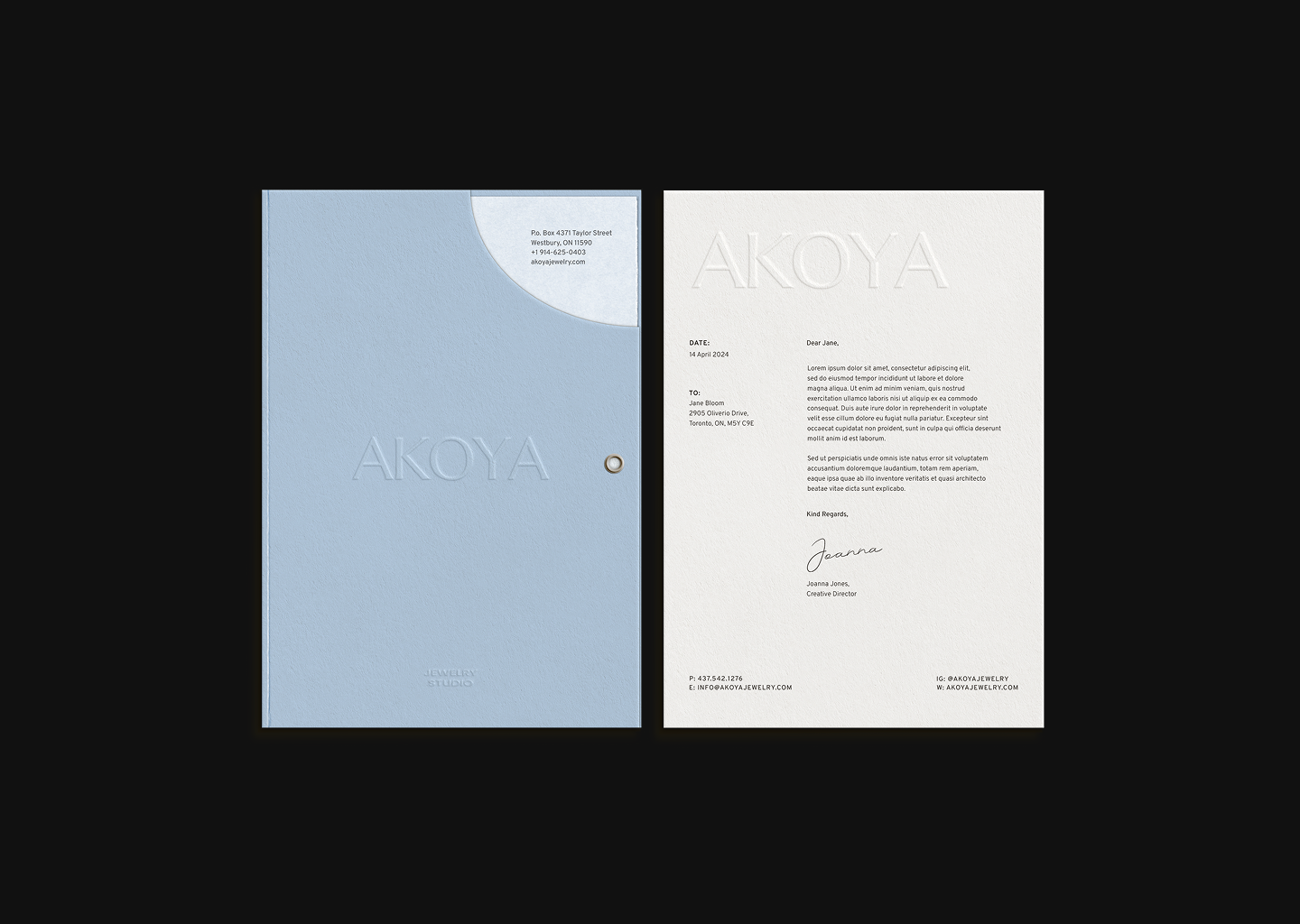
Printed Materials
Digital Assets